Previous logos
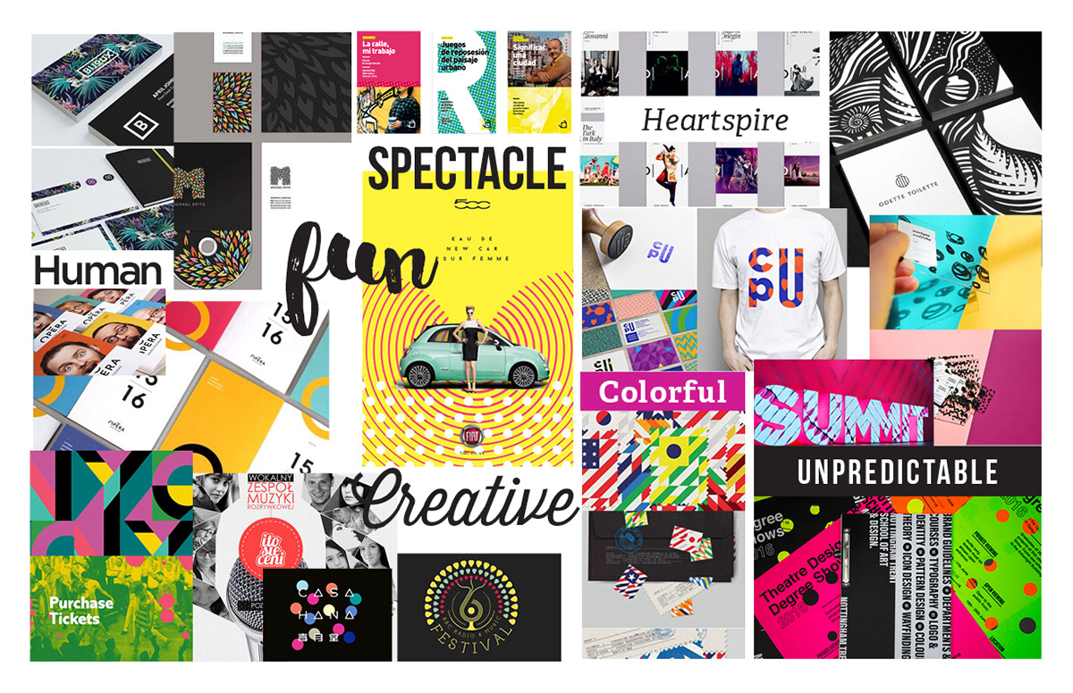
Approved mood board and branding direction
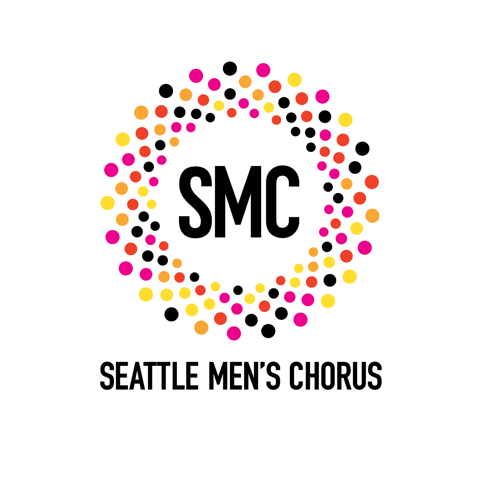
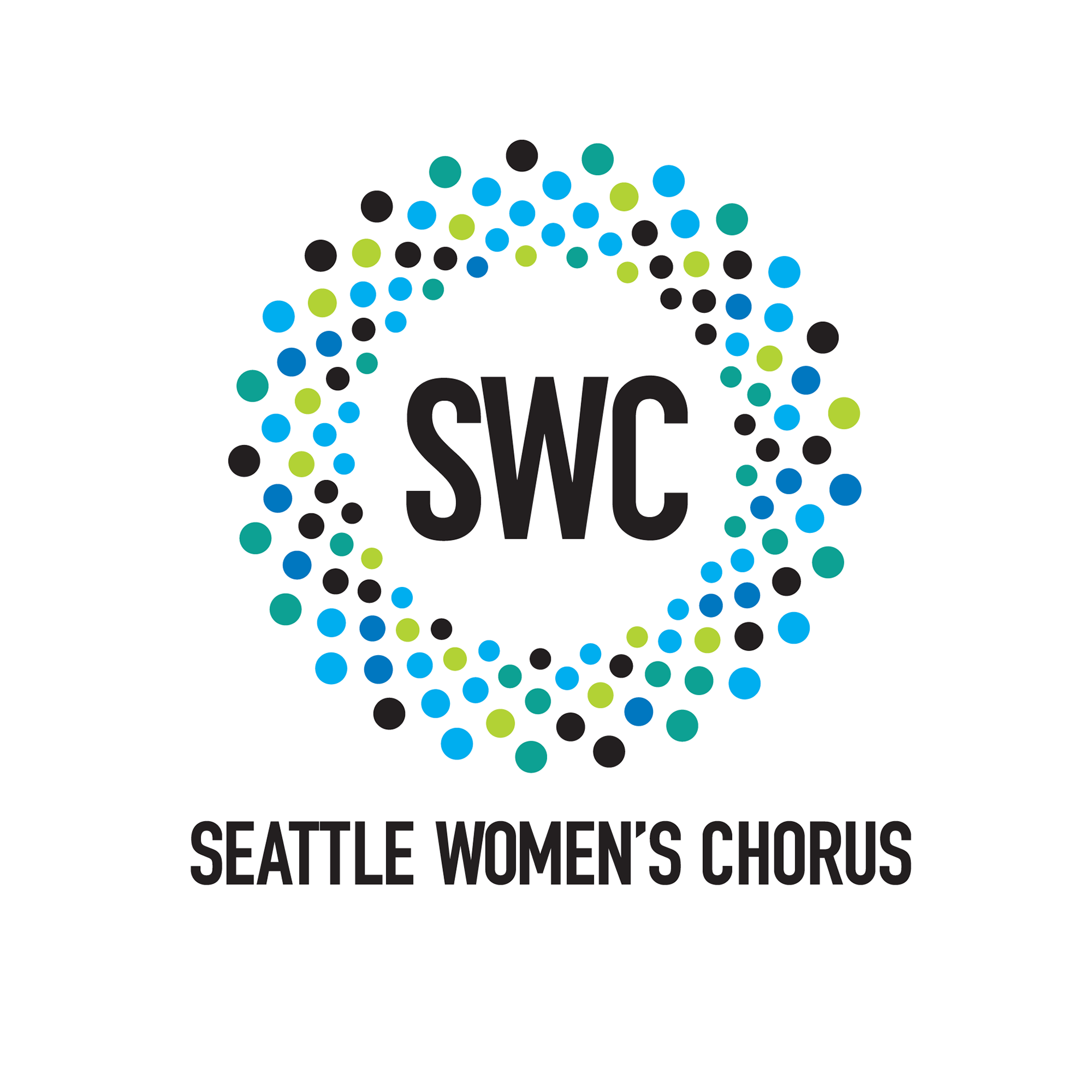
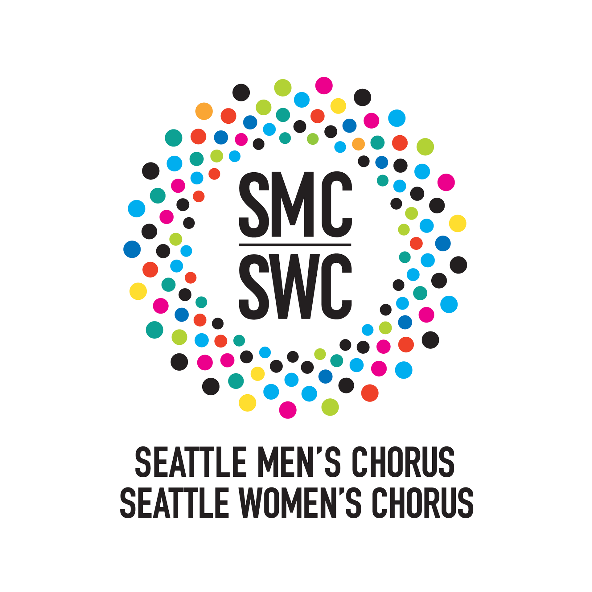
New Seattle Men's Chorus and Seattle Women's Chorus logos
The dots in a circular pattern simultaneously represent chorus members, audience members, the inclusive ‘family,’ lights, stage, and production—all with SMC and SWC center stage.
The different colors of each dot abstractly represent both the diversity of the chorus and the audience, as well as the shimmering of theater lights.
The bold color palettes of each design are complements of one another; SMC’s logo is embracing reds and oranges, with SWC’s featuring blues and greens. And the combined logo, which is my favorite, brings the whole range of colors (and members) together in harmony.
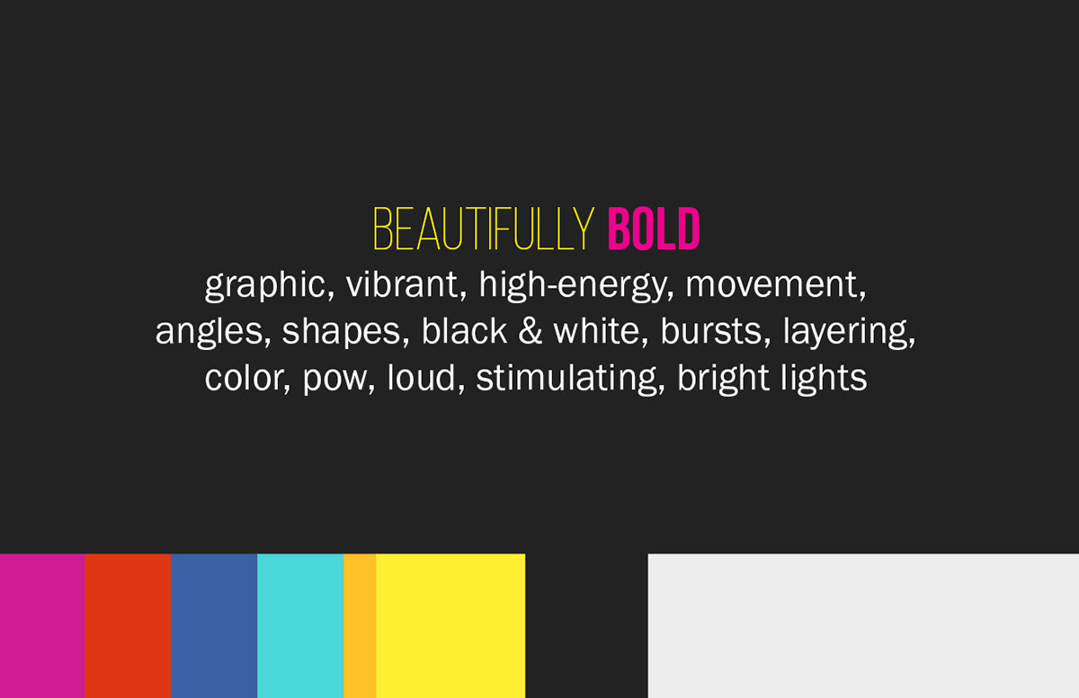
The new logos represent energy, fun, spectacle, color, humanity, creativity, vibrancy, heart, diversity, family, unity, and unpredictability—all things Seattle Choruses.