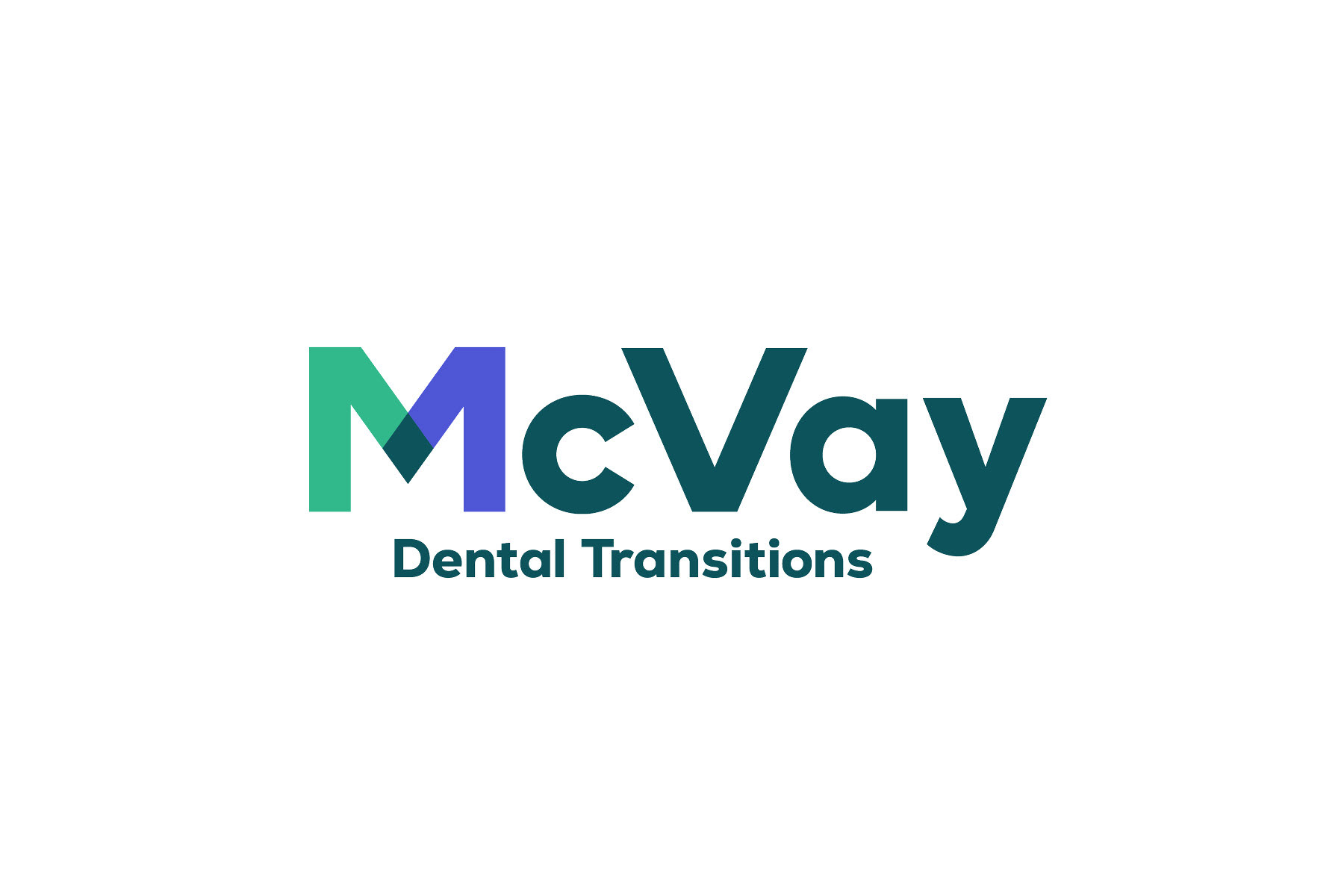
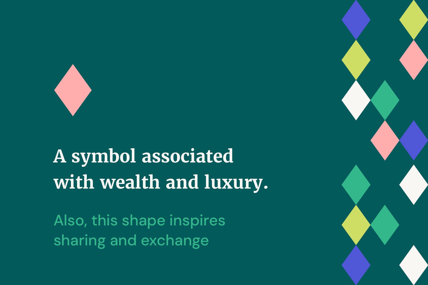
The McVay Transitions logo includes a diamond shape—symbolizing luxury, precision, and lasting value. The concept centers on two mirrored sides of the “M” meeting to form this shape, representing connection and transformation. It reflects McVay’s core purpose: bringing two sides of a transition together. Clean lines and symmetry evoke clarity, trust, and the refined experience clients expect in a high-value transition.
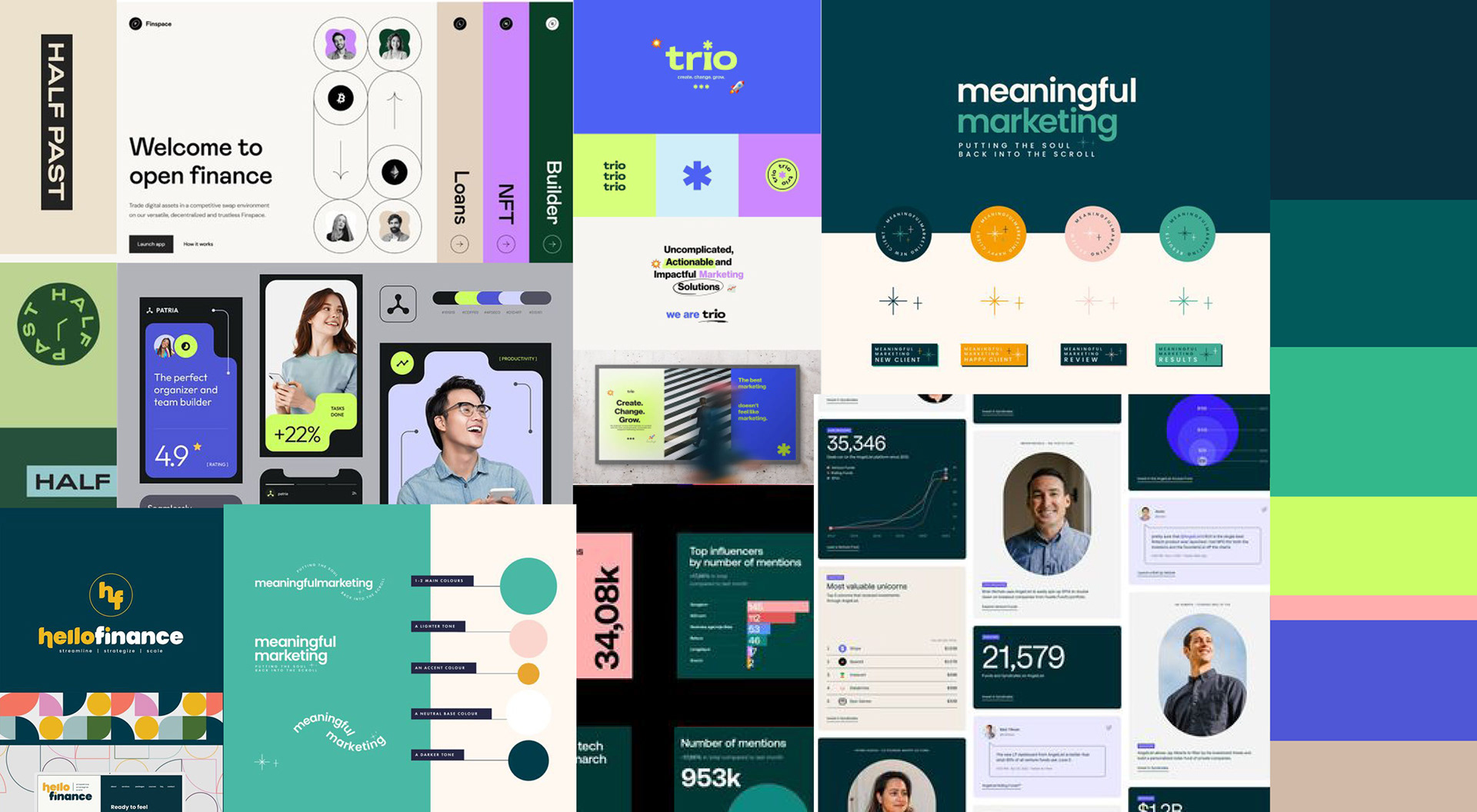
After the initial brief, I presented three distinct moodboard directions. This concept was selected as the final direction.
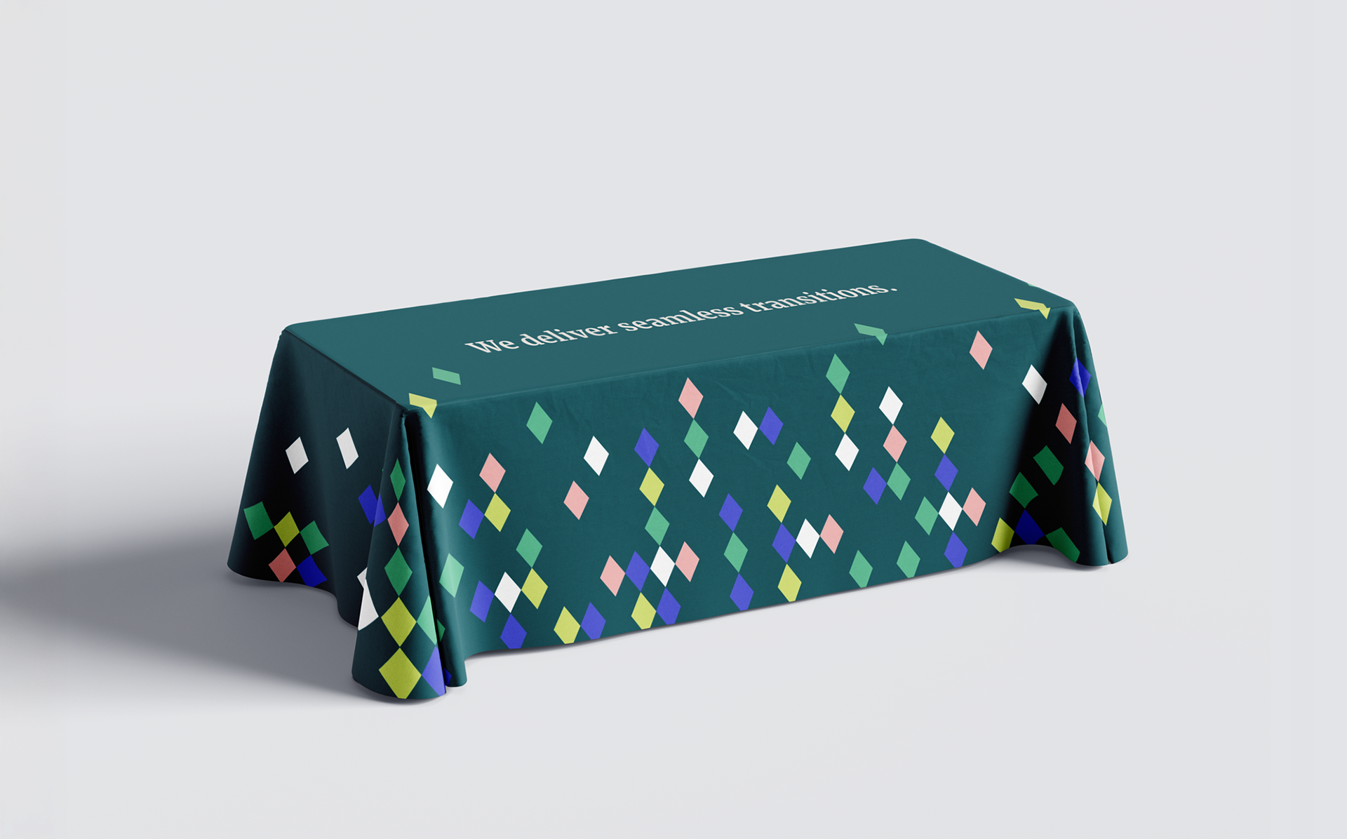
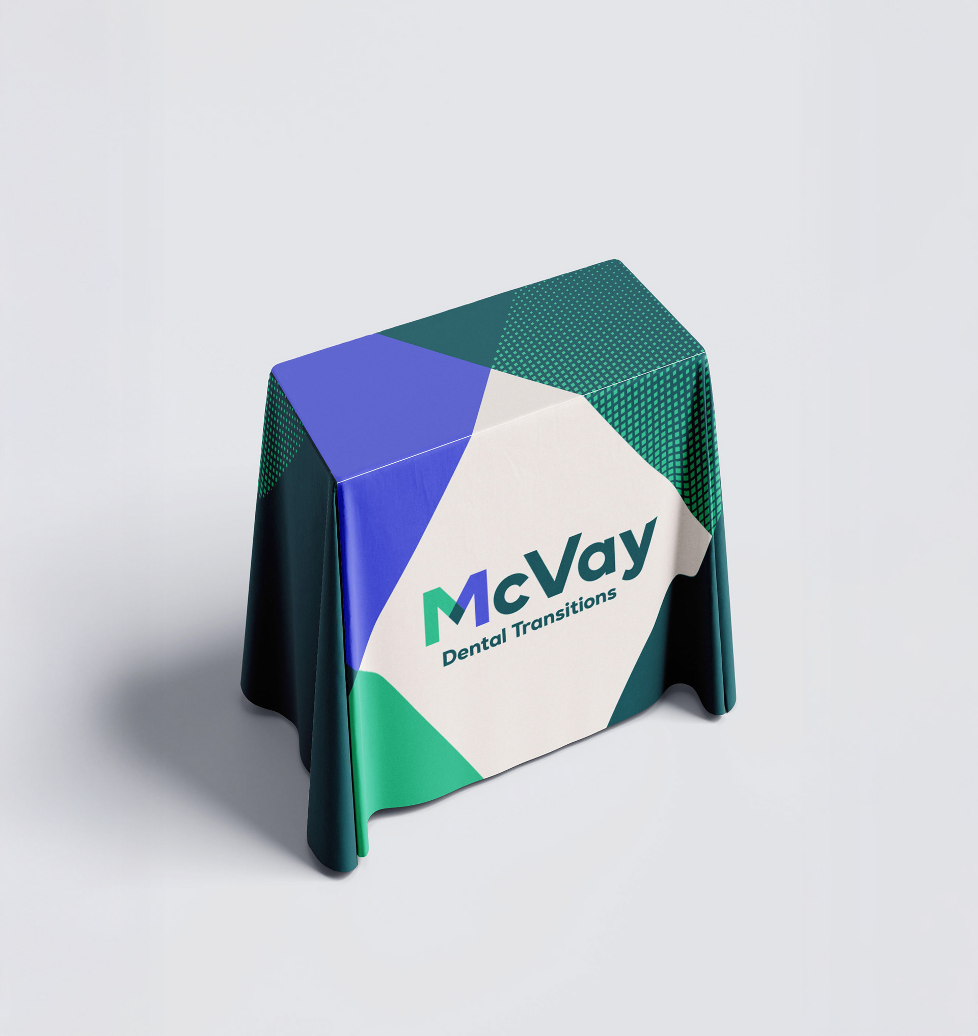
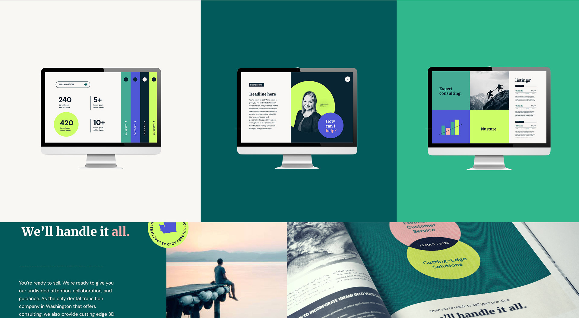
Fast mockups that bring the brand to life beyond the logo, allowing clients to see its full depth and dimension

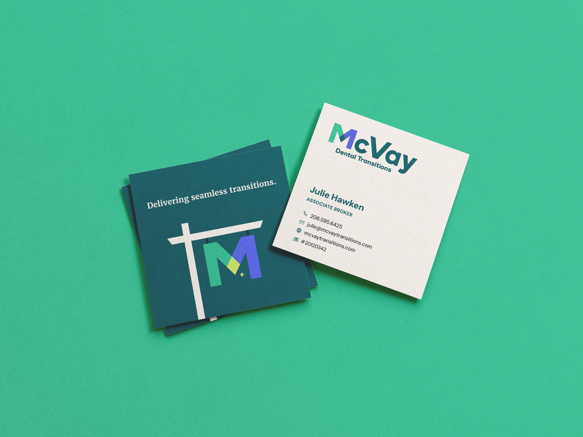
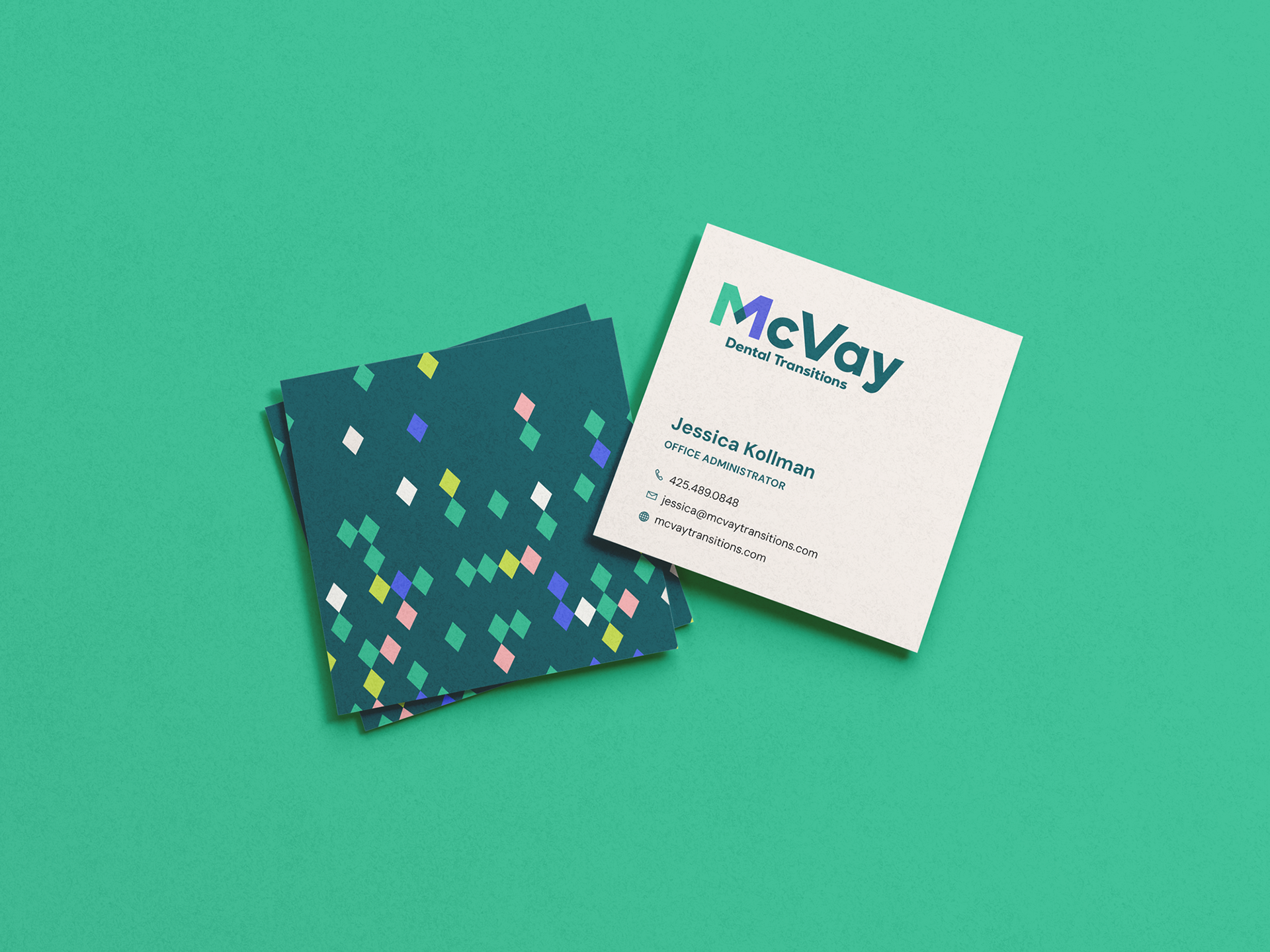
Business cards
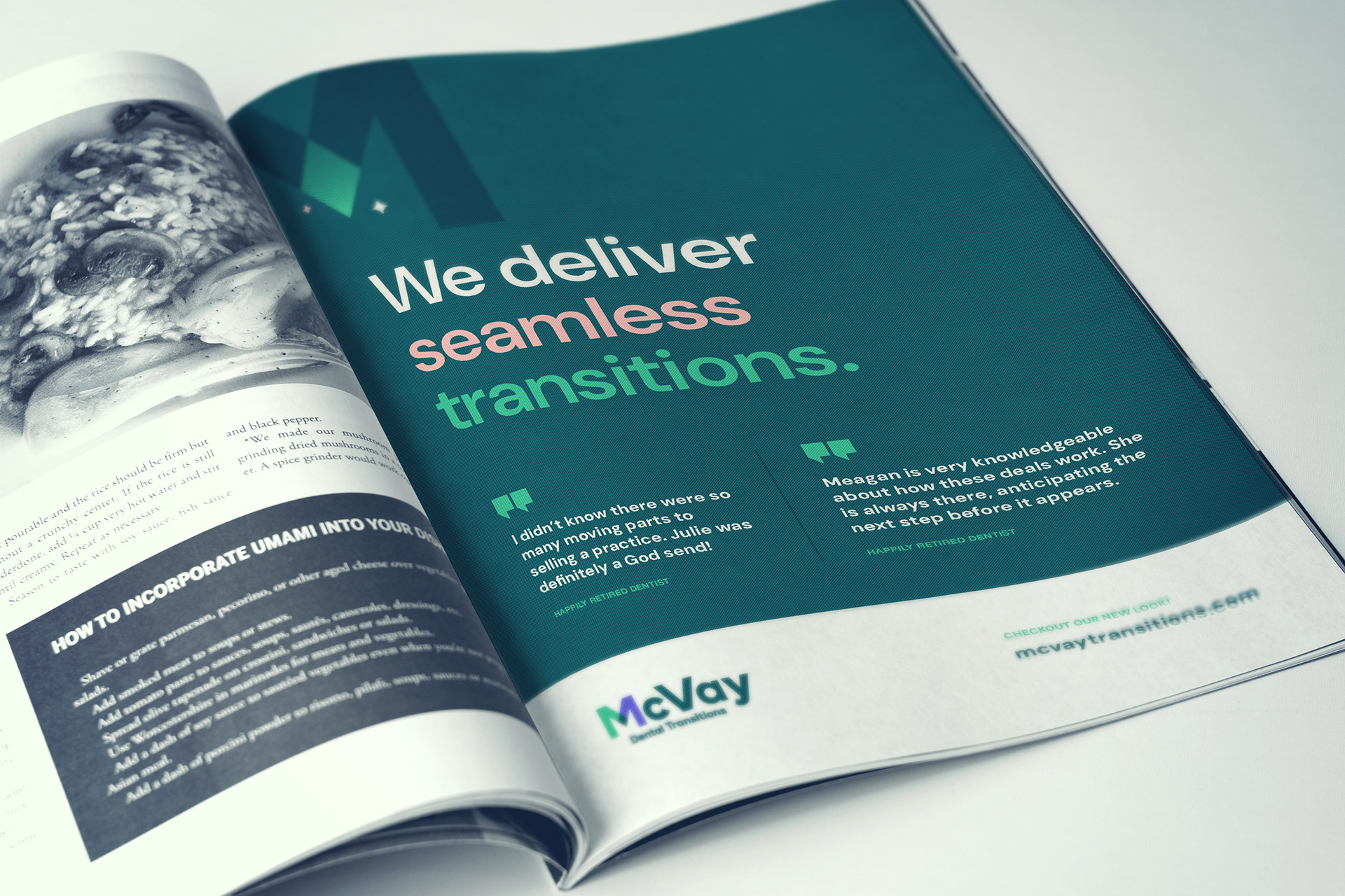
Full page print ad design
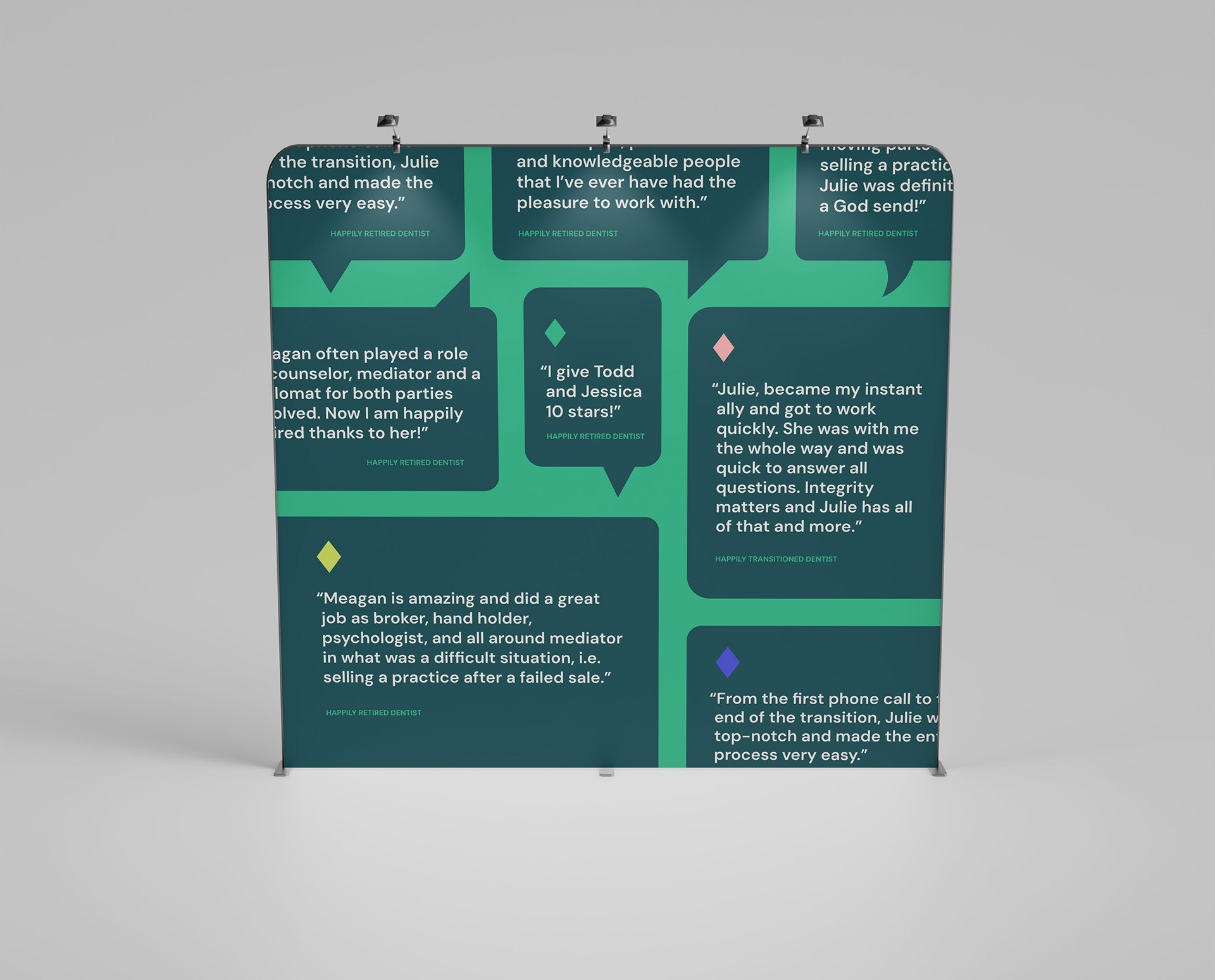
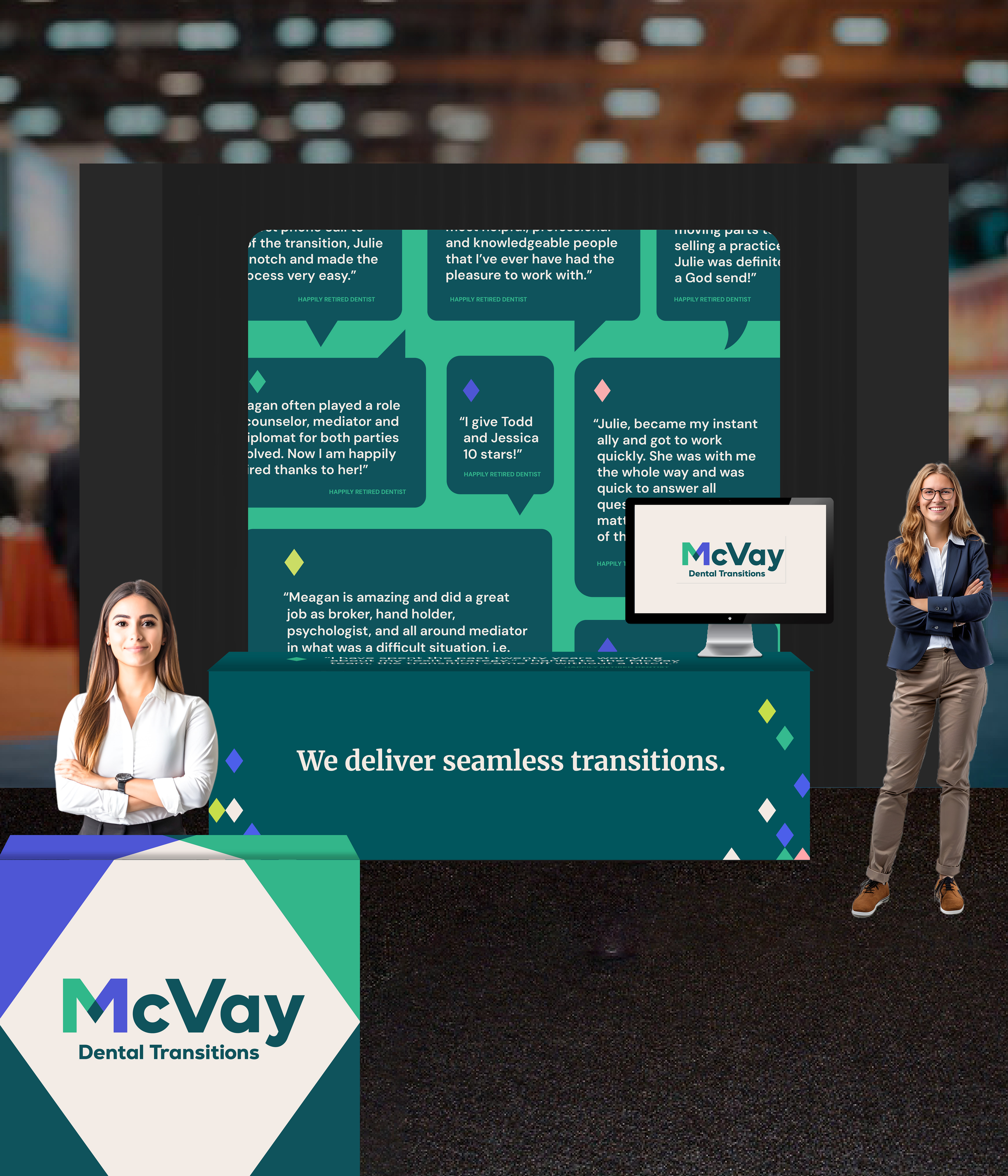
PNW Dental Conference booth design, including an 8′ × 8′ backdrop and two tablecloths.