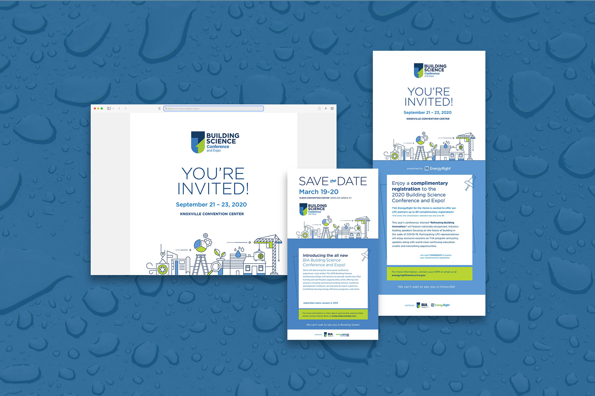
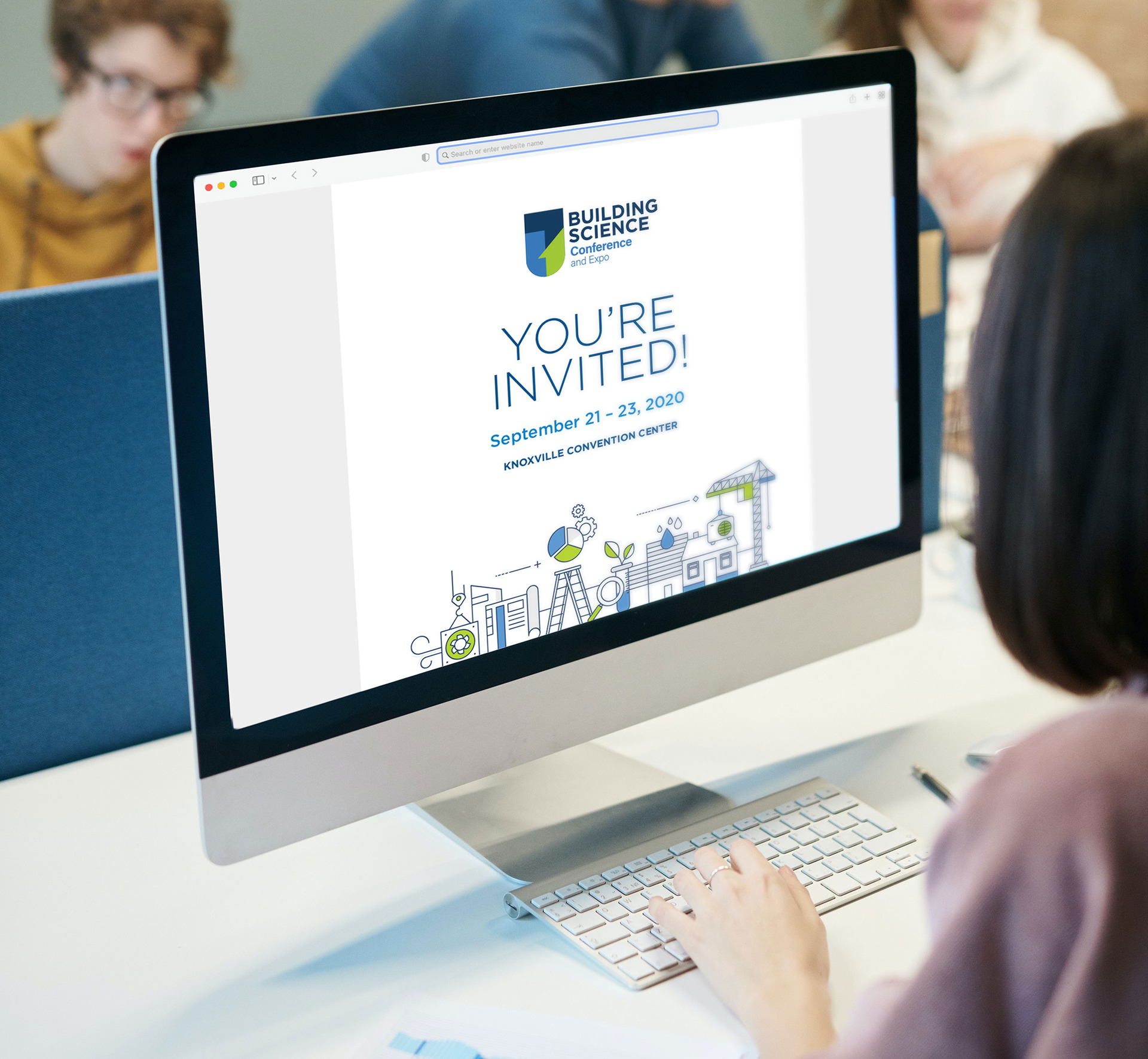
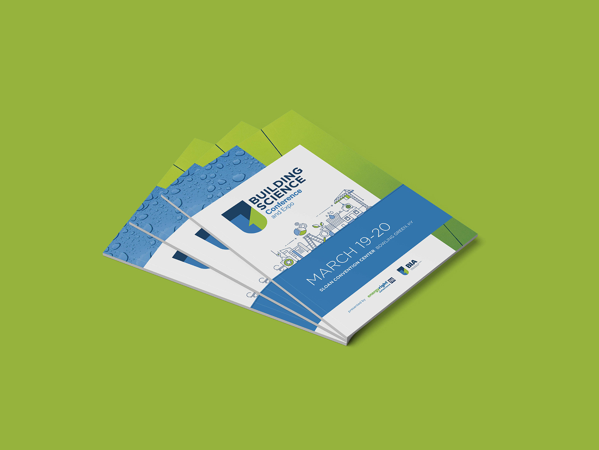
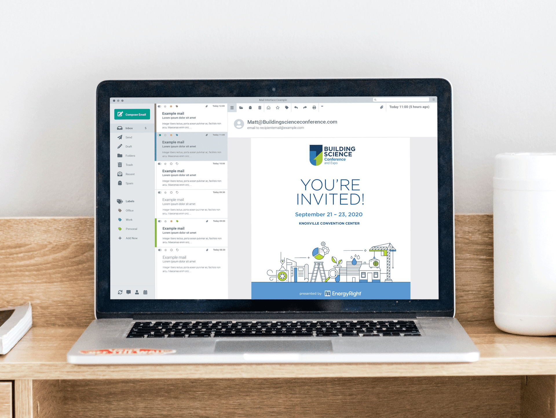
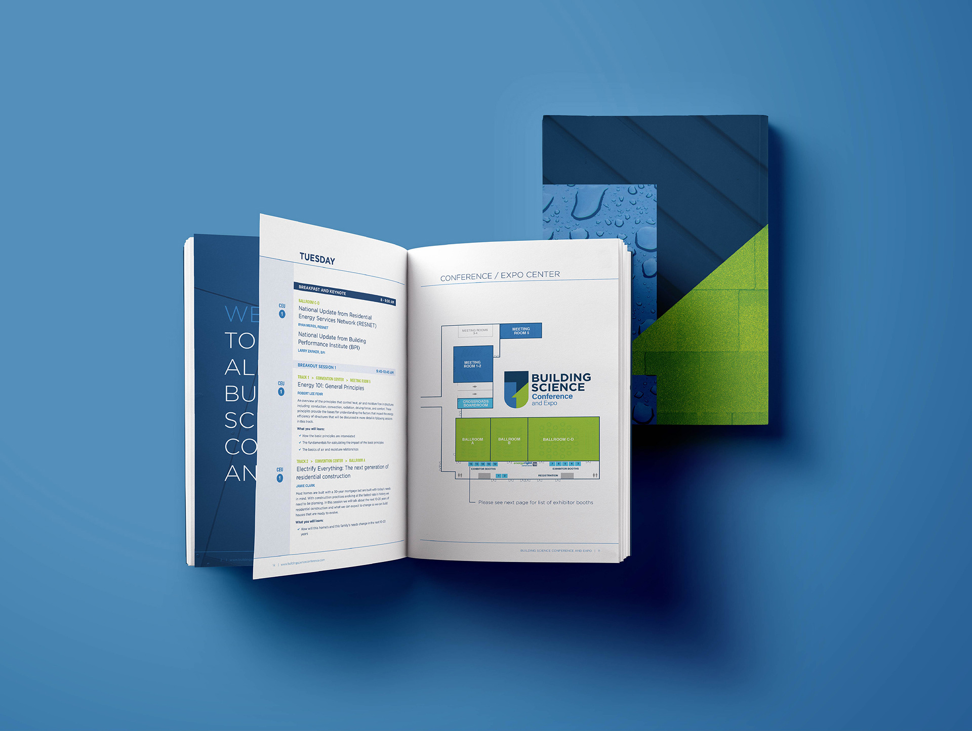
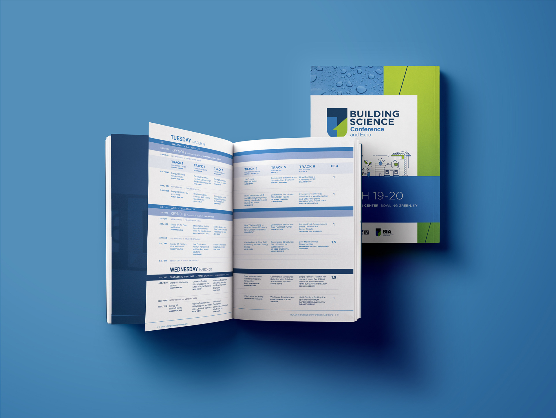
I was provided a logo from the conference management team and asked to build a matching visual identity. Using the color palette defined in the logo, I developed a refreshed look and feel for their print and digital advertising, invitations, and conference materials. We used textures inspired by building materials, bright color blocks, and fun illustrations to create a bold yet professional style that helped attract a larger audience, and better reflected the breadth of topics this new conference curriculum would provide.